Greenery needed a logo refresh to better reflect the handcrafted, down-to-earth nature of their sustainable, homegrown floristry business. They also needed circular stickers and stamps designed for packaging, and some advice on updating the look of their website. I created the new designs, and also presented a visual update suggestion for the website, to implement on their end as they saw fit.
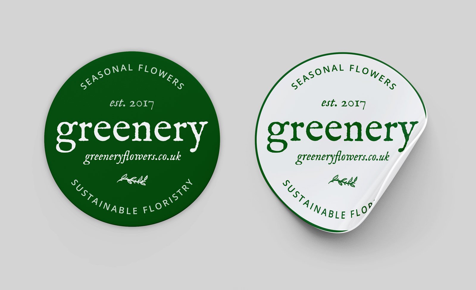
Green and white sticker designs

Stamp designs, based on the stickers, in use on simple paper packaging. The client decided these are more sustainable options than stickers, so the latter will be used elsewhere if needed.

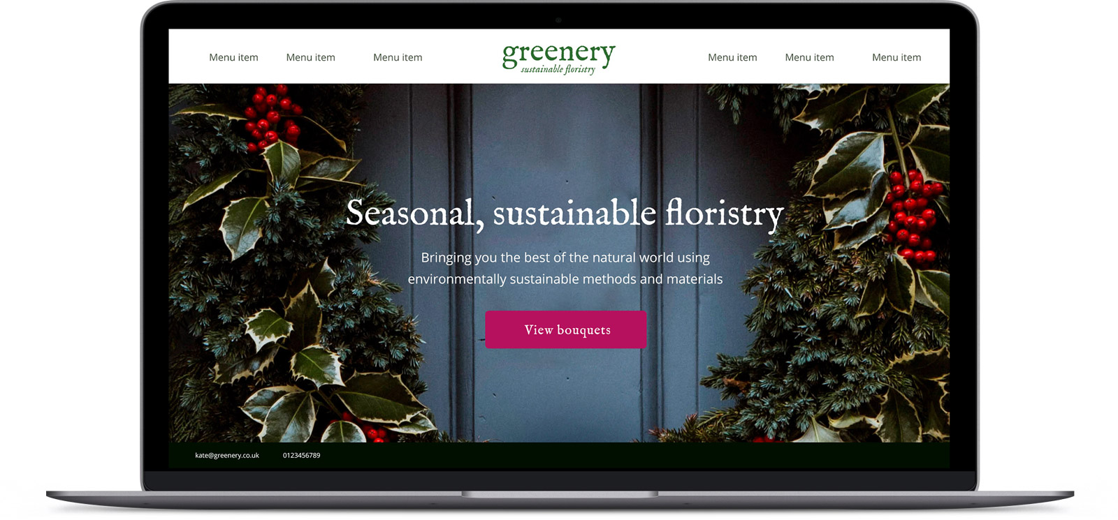
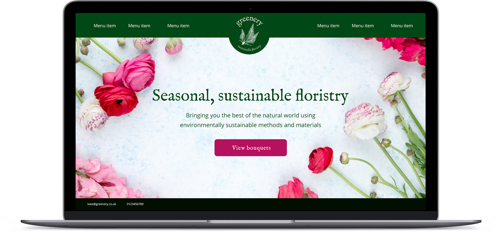
Simple website mockup drafts, with a suggestion of using photos of relevant seasonal flowers, and a strong headline with call to action - something that was not present on the existing site.


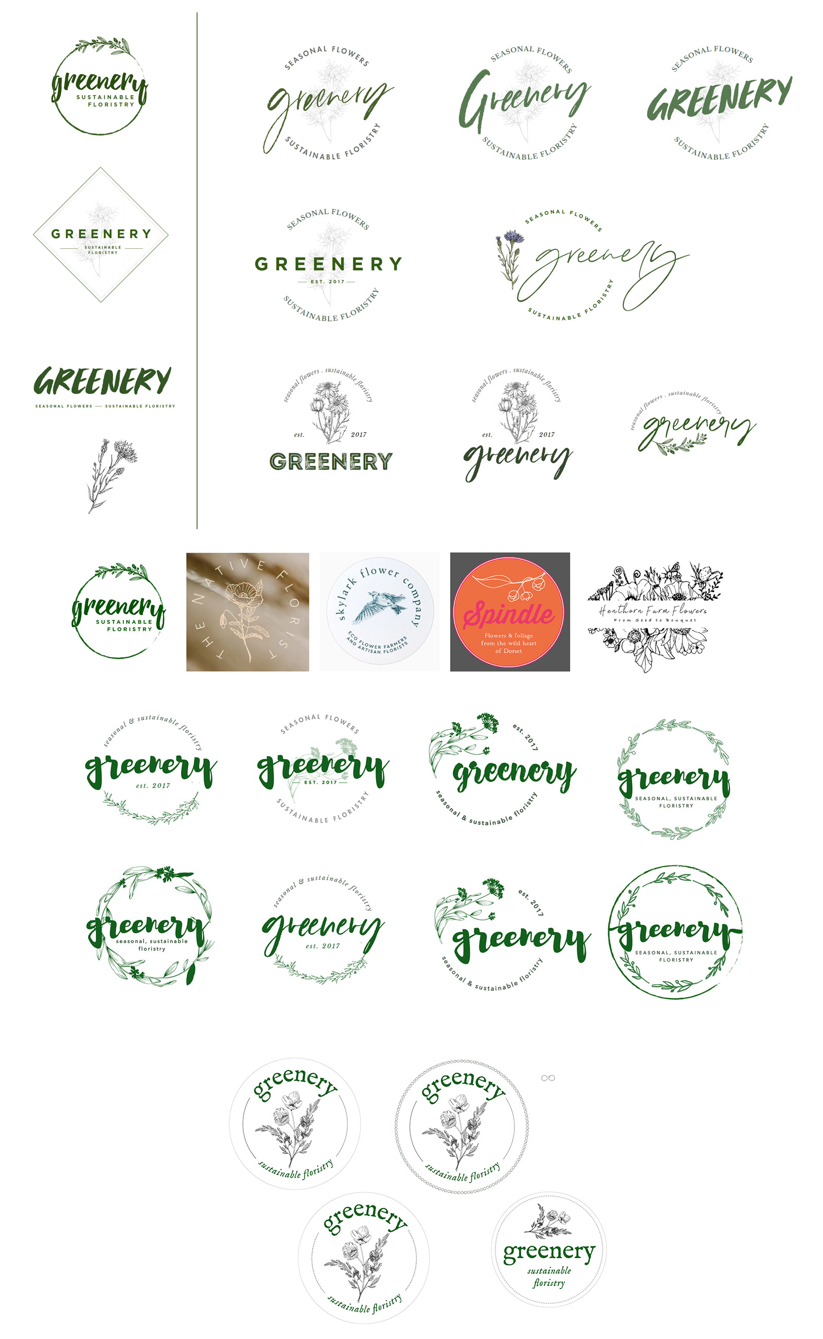
Finalising the logo was by far the most challenging aspect of this project. The client had several requirements about what they wanted, but I kept feeling that if we put all those into a design, it just doesn't work that well. In the end, the lowercase lettering was what we decided to keep, but instead of handwriting style text, we chose a rough, farmhouse-style font that is rustic but still more legible than the handwriting. We also compromised in that the stickers and stamps could be circular, but there would be a straight version of the text part of the logo for more flexible use across multiple media.
Initially, the client had wanted a variable, seasonal illustration of flowers as part of the logo, so I tried a lot of options with that, but in the end they decided not to proceed in that direction.
