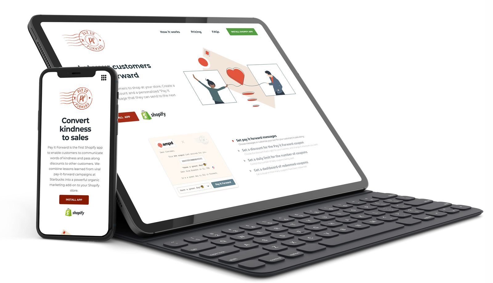
Pay It Forward is a new Shopify app. It helps online retailers attract repeat customers, by offering them a surprise discount code, with the choice of "paying it forward" for the next user. If the first user does decide to be nice and pays it forward, they also get a surprise voucher for themselves too! Spreading joy and unexpected delight is a key part of this brand.
I created visual designs for the pop-ups users will see, and coded them myself, as well as adapting existing email templates to fit in with the new brand. I also created a homepage layout in Webflow for the client to manage themselves going forward.
The process to get to these designs involved several iterations based on the moodboards and team feedback; the client decided to go for a vintage post/note card feel. Check out the case study below to see how we got there!
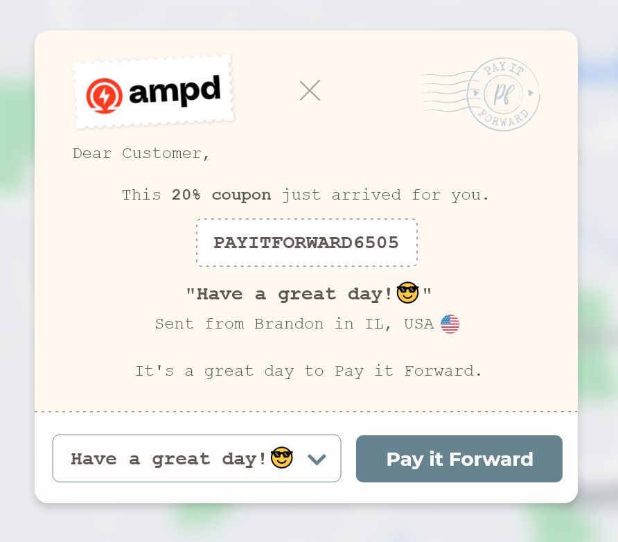
The first pop-up someone would see - this would happen after they've checked out their cart on the retailer's website. The Pay It Forward logo is a subtle colour here so as not to distract too much from the retailer's logo on the left.
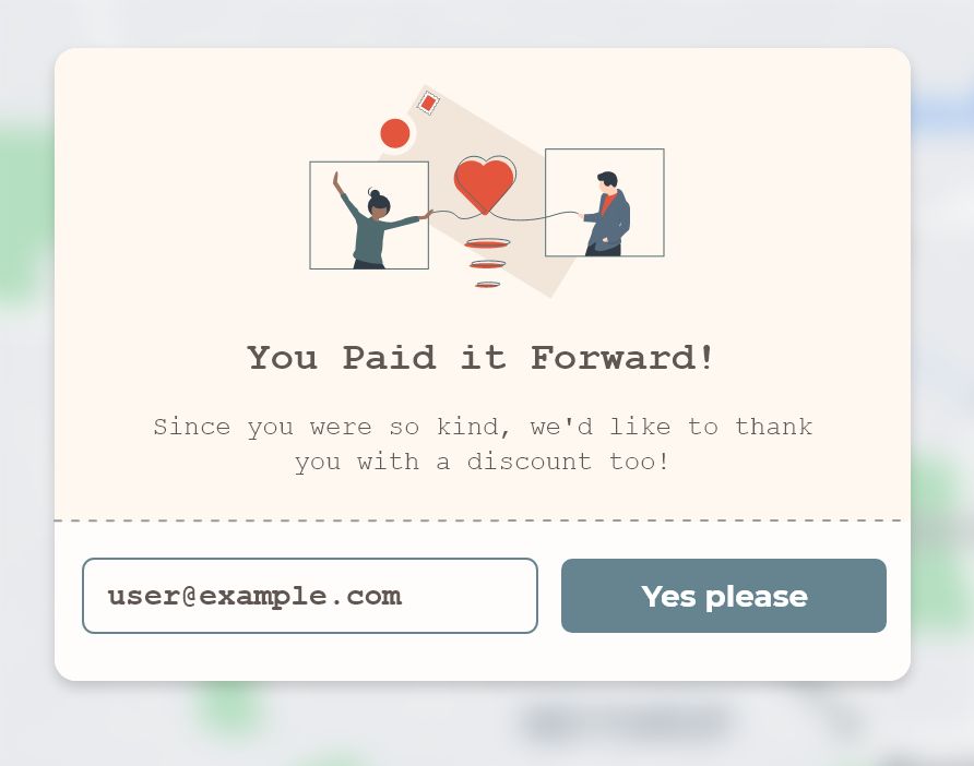
This is what they would then see as a surprise - they just have to confirm their email (pre-filled from the cart checkout process) and they also get a coupon. The illustration used here was provided by the client and recoloured by me to match the brand colour scheme.
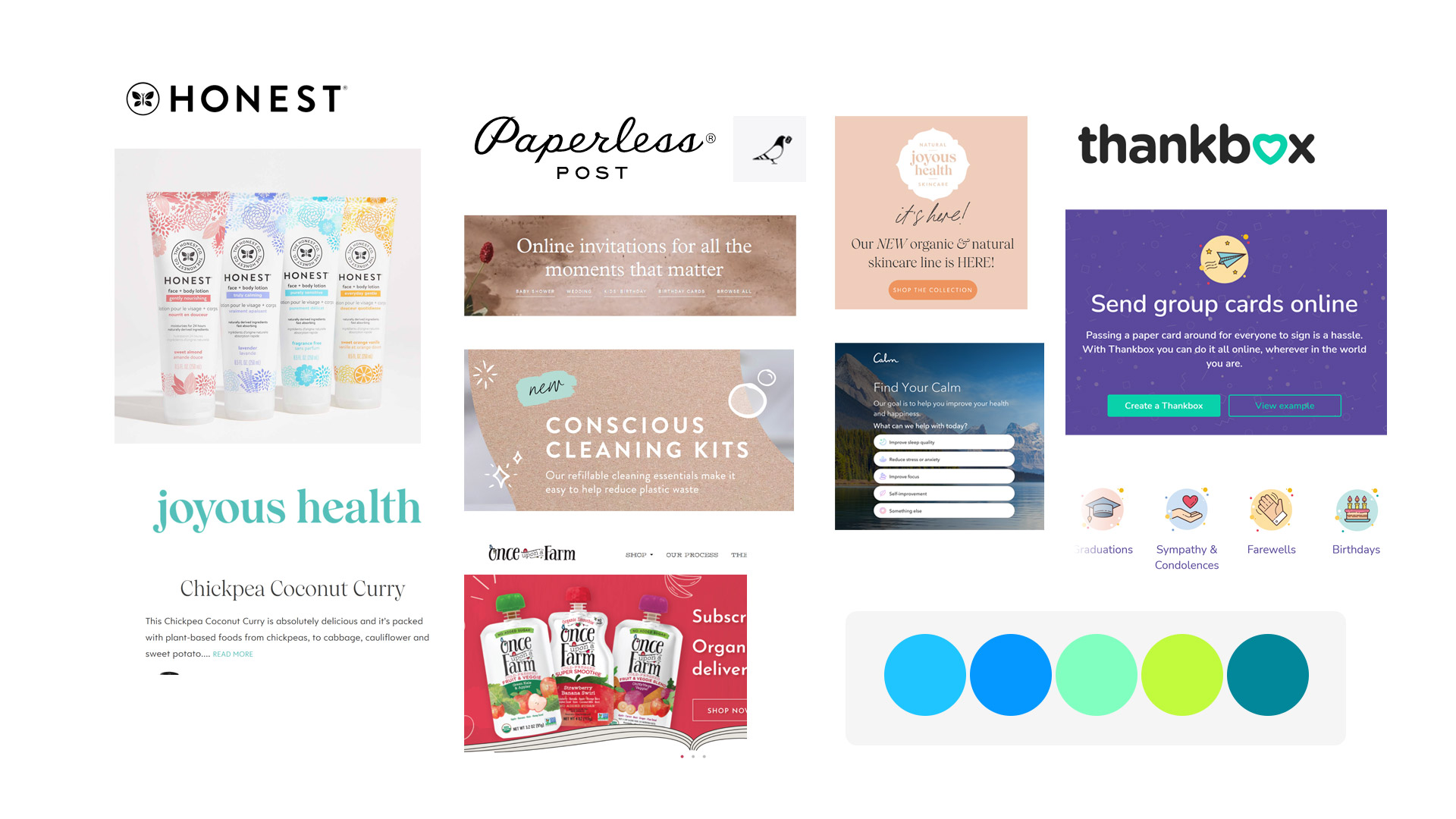
The first moodboard, based on visual & brand references provided by the client.
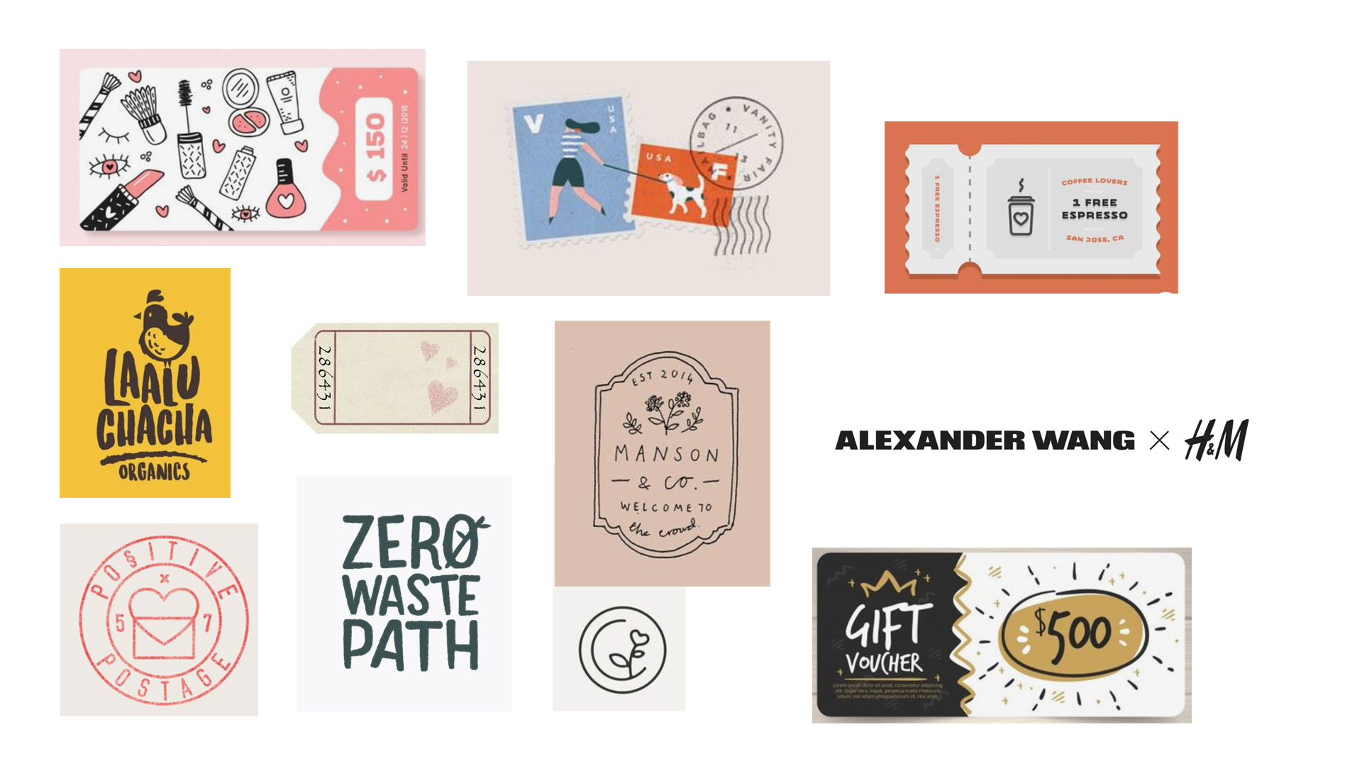
The moodboard I put together as reference for the logo design and ideas for how to achieve a more handcrafted approach.
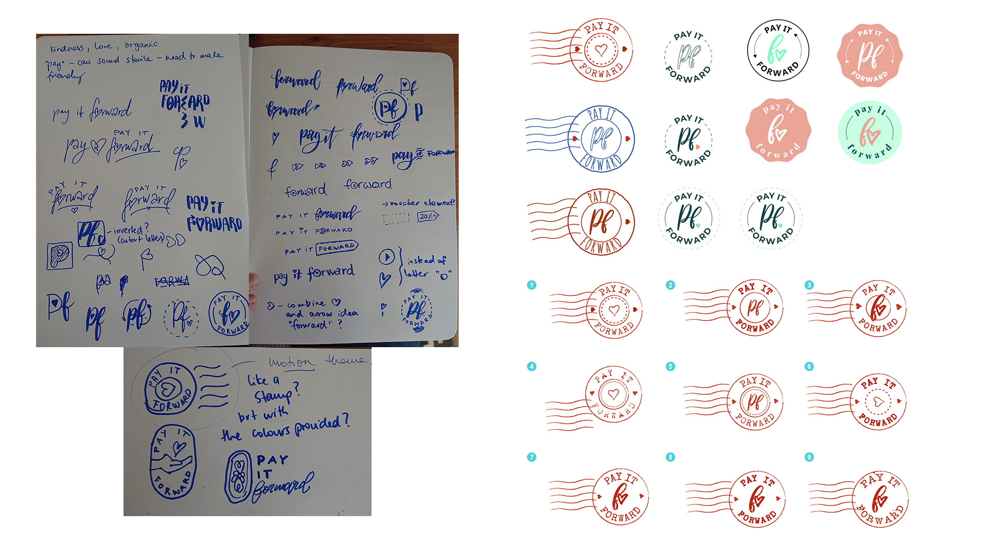
Initial rough sketches and further development of logo options based on client feedback. We both loved the idea of a postage frank stamp, which would also allow the client to use only a simplified part of it for an icon where a full logo is not easy to use due to limits on available screen space.
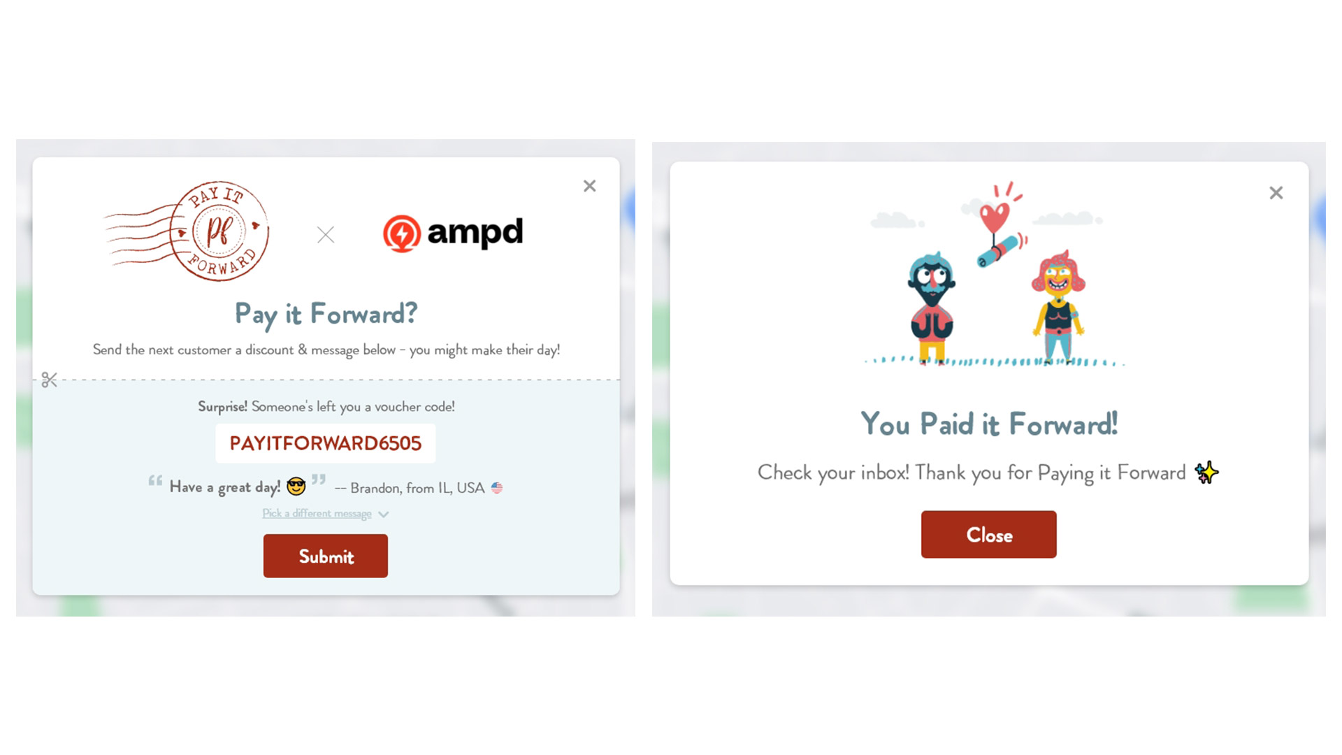
First round of mockups of the pop-ups. It was after this point that the direction was changed to more of a vintage paper style.